The first global corporate responsibility program for EY employees
Length: 3 Months
Role: Senior Product Designer (UX/UI)
Skills: UI design, Style guide, User flow. Wireframing, Prototyping, User testing and Information architecture
The Brief
At a time when EY faced growing scrutiny around its contribution to the wider community, CEO Mark Weinberger set out to leave a meaningful legacy by championing a new initiative focused on social impact. The vision was to create an internal corporate social responsibility platform that would empower employees to give back through professional, skills-based volunteering.
The platform aimed to increase participation in initiatives that supported young people and social impact entrepreneurs, enabling employees to contribute their expertise in a meaningful way.
My role was to design both the back-end administration portal and the employee-facing platform. The challenge was to ensure both experiences were intuitive, efficient, and scalable. Supporting the needs of internal teams managing initiatives, as well as employees discovering and signing up for them.
The Process
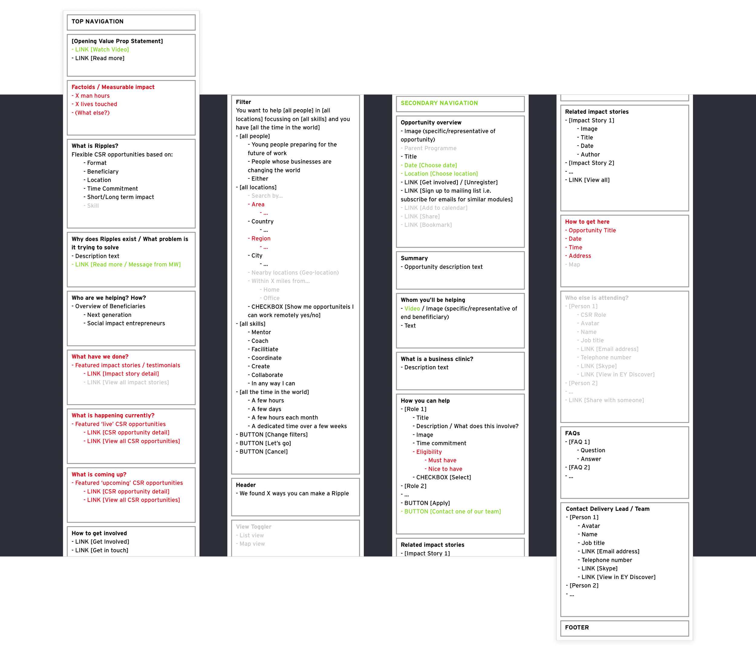
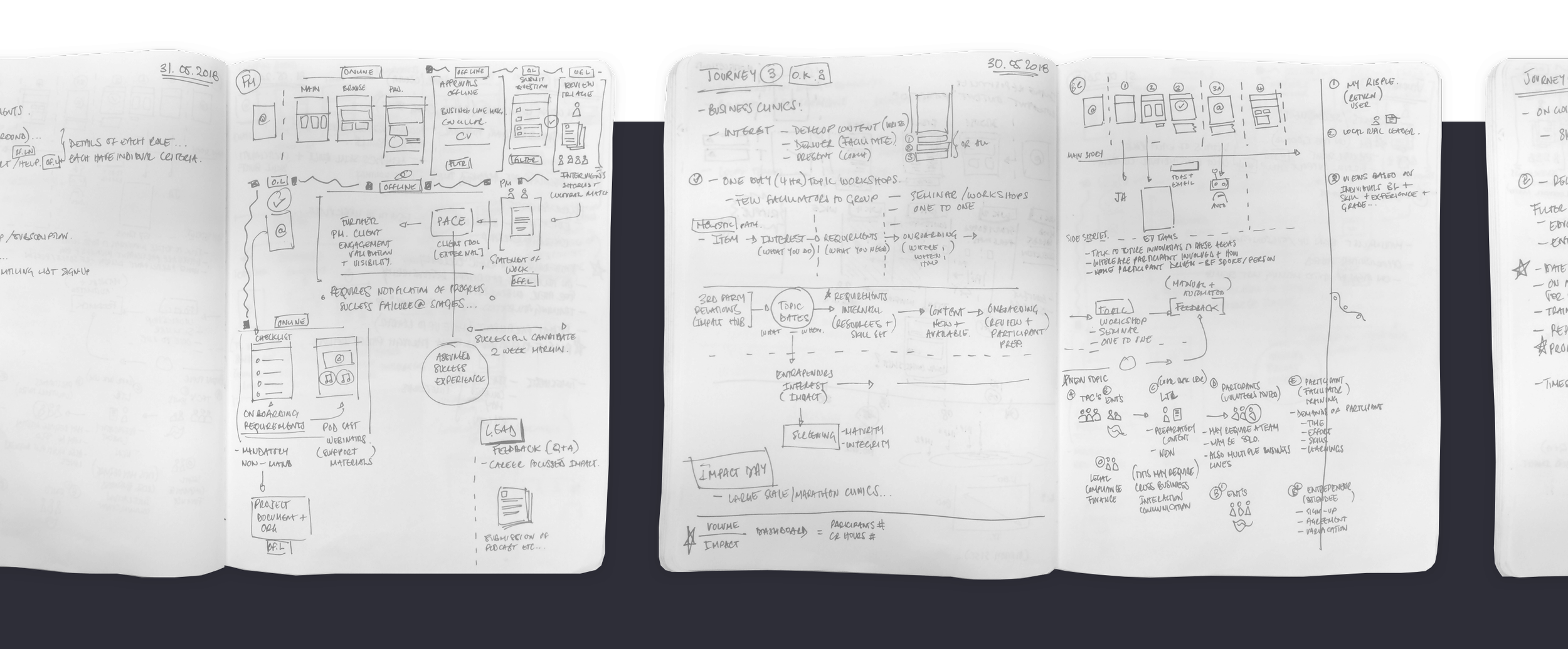
An early version of the administration platform already existed, allowing teams to upload and manage initiatives. I began by auditing and mapping the current end-to-end administrative flows to understand how initiatives were created, reviewed, and published.
This revealed a highly linear and fragmented process. Multiple handoffs between members of the Corporate Responsibility (CR) Delivery team created bottlenecks, often resulting in stalled or incomplete initiatives. The system was time-consuming, unintuitive, and prone to errors.
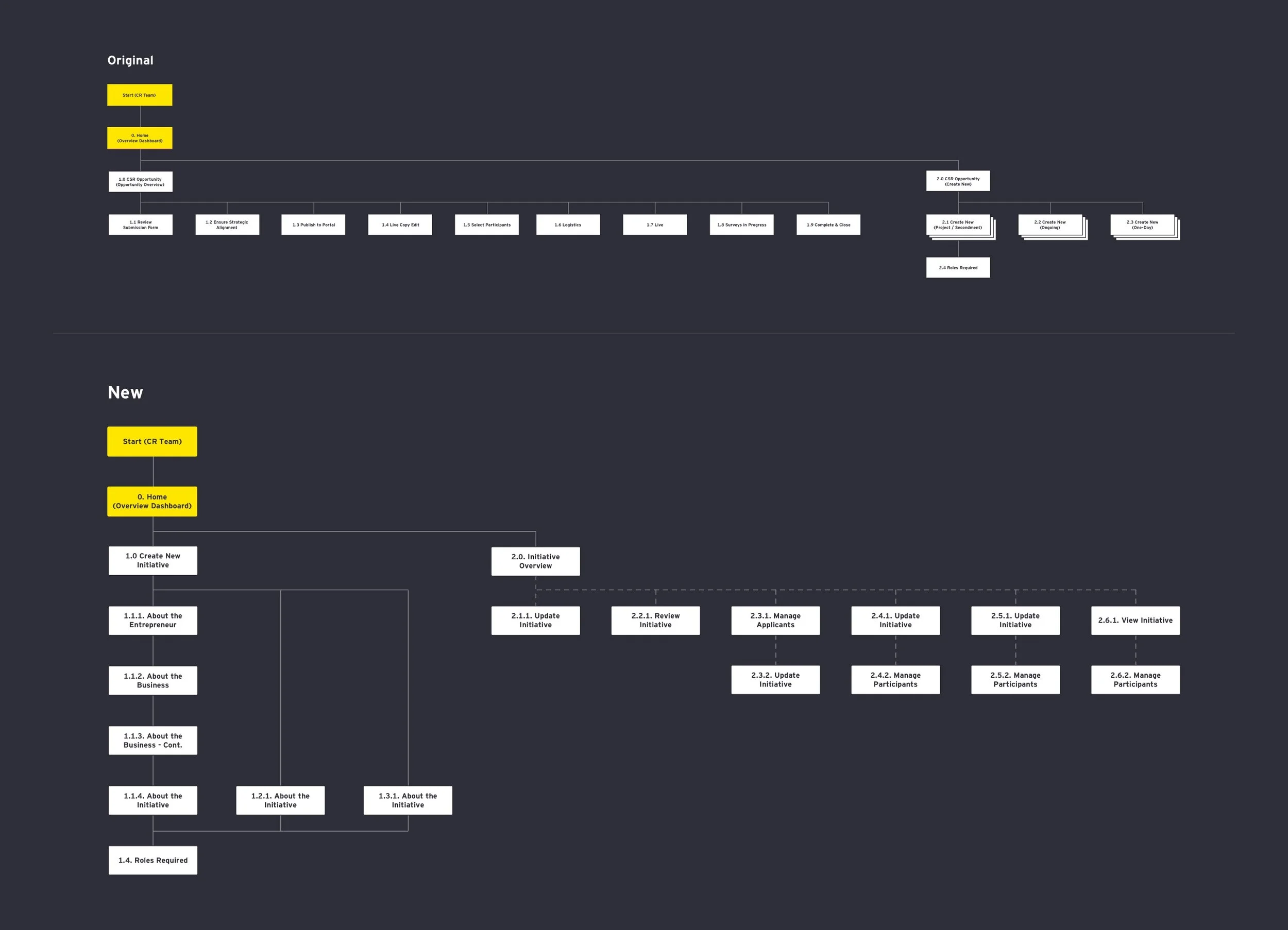
There were three distinct types of initiatives, each requiring different levels and types of information. However, the existing platform treated them all the same—forcing users through identical steps regardless of context.
To address this, I redesigned the flows to be more adaptive and context-driven. Instead of a rigid, one-size-fits-all journey, the experience dynamically adjusted based on the type of initiative being created. This reduced unnecessary input, streamlined decision-making, and significantly improved efficiency—allowing teams to get initiatives live faster and with fewer blockers.
The Users/Employees
I conducted initial user interviews to understand what employees expected from the platform and what would motivate them to engage. These insights informed the content strategy and overall experience design.
Working closely with the lead UX designer, I helped create content priority guides for key pages across the employee platform. This allowed us to define clear information hierarchies early on to ensure users could quickly access what mattered most without being overwhelmed by detail.
A consistent theme from both research and my own experience as an EY employee was that internal platforms were often overly text-heavy and difficult to navigate. Users wanted a more engaging, visually balanced experience that prioritised clarity and ease of use.
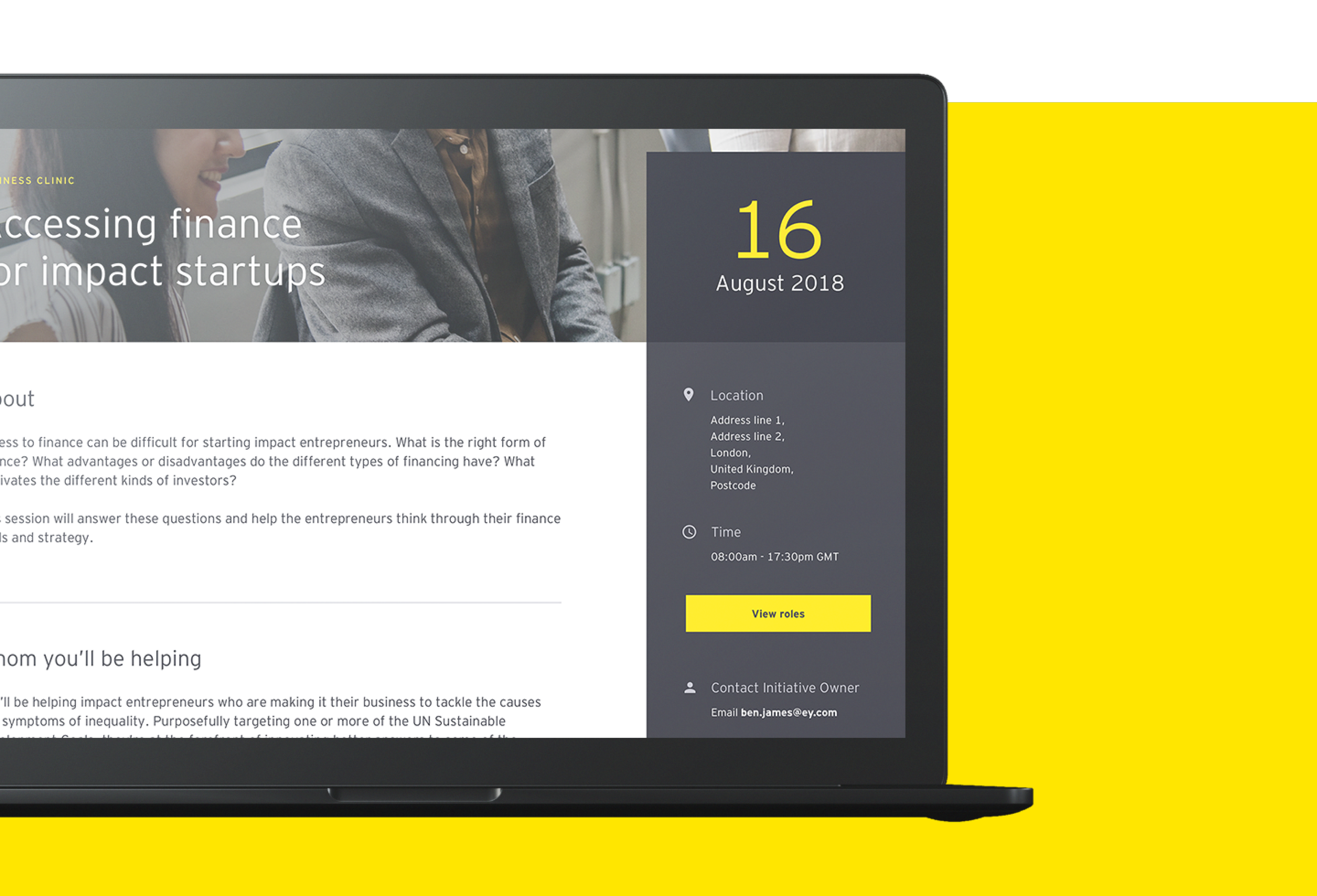
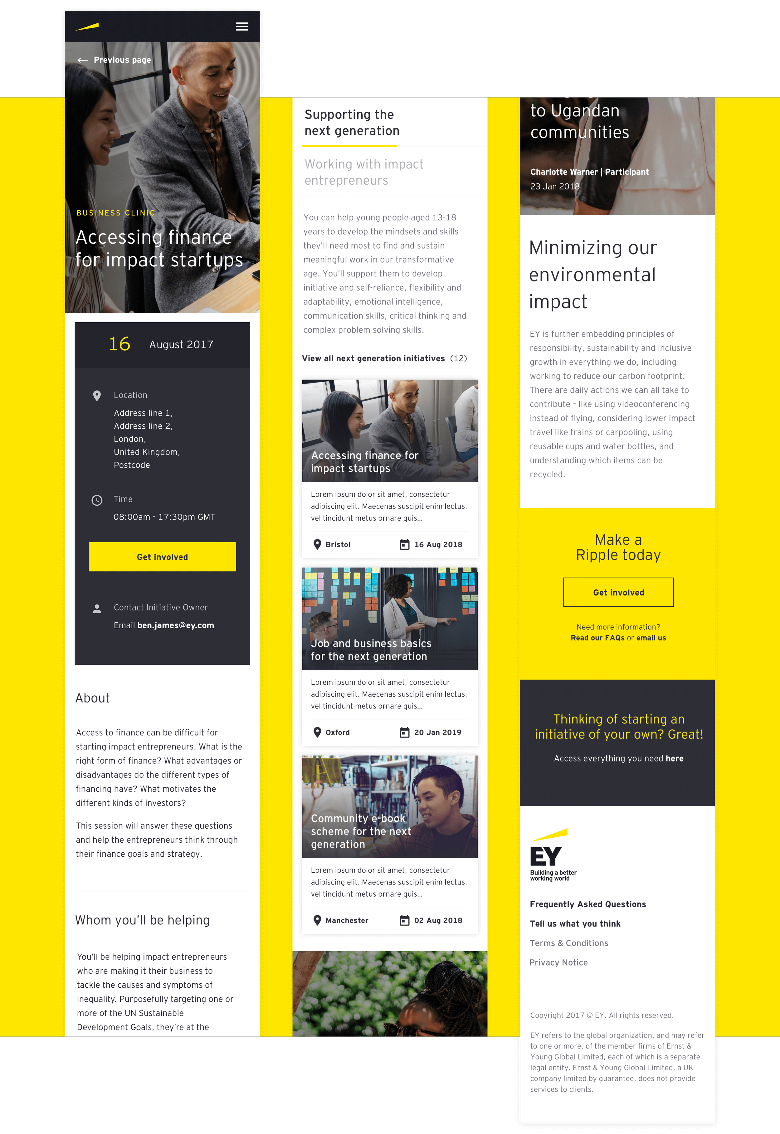
For initiative pages in particular, the challenge was to strike the right balance and provide enough detail to inform decision-making while keeping content concise and compelling. Key information such as dates, duration, location, and required skillsets needed to be immediately visible and easy to scan.
User Testing
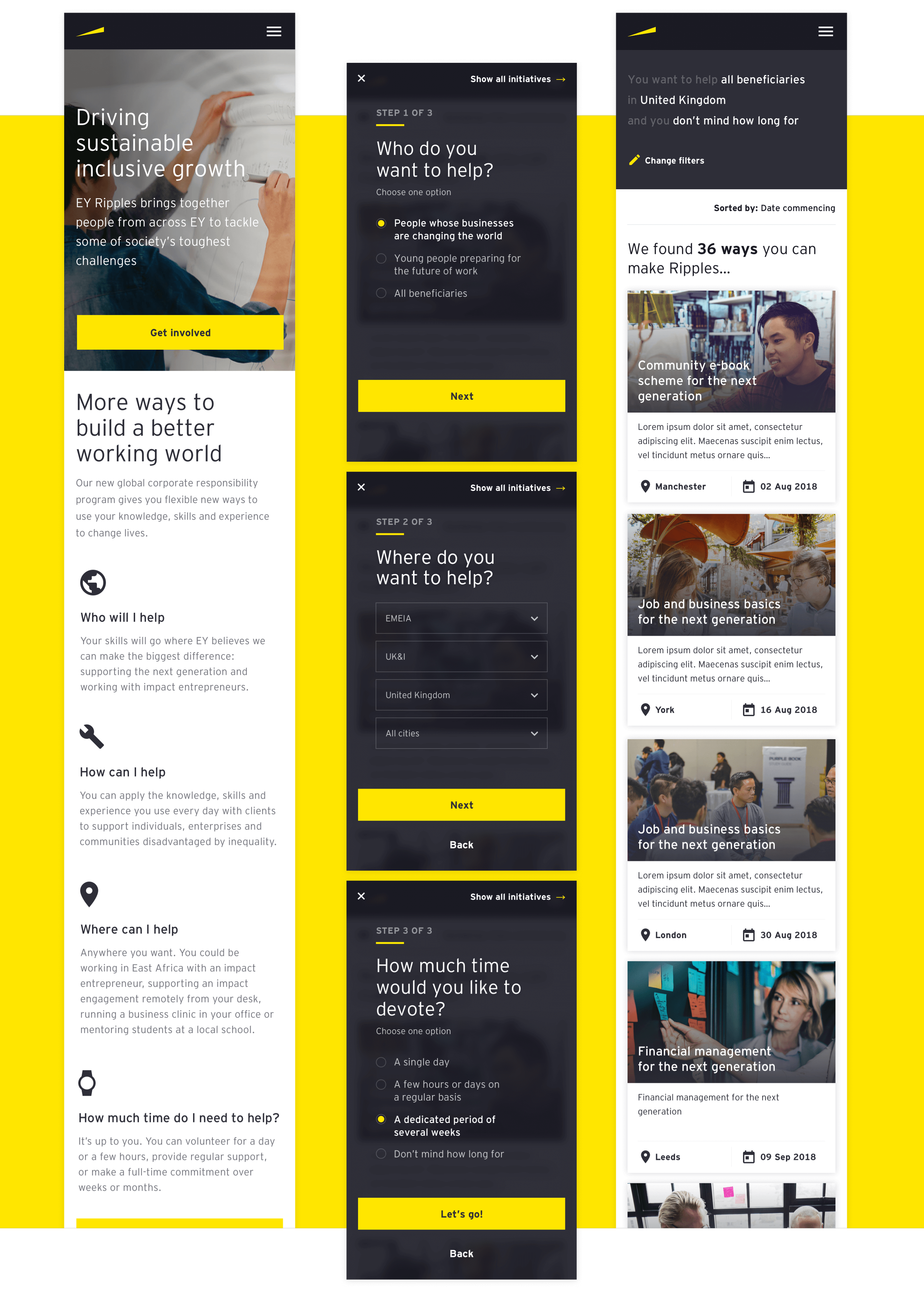
The homepage was initially designed as a marketing and educational entry point, introducing users to the platform’s mission through a horizontal, click-through experience.
However, user testing revealed a clear pattern: employees were bypassing this content entirely and clicking straight on the “Get Started” call-to-action. Given the time constraints and task-oriented mindset of users during the workday, they were far more interested in quickly accessing relevant opportunities than engaging with introductory content.
This led to a poor first experience. Users landed on an unfiltered catalogue of initiatives sorted only by most recent, resulting in low relevance and high drop-off rates.
To address this, I introduced a set of lightweight, interstitial filtering steps. Users were asked three simple questions to tailor the content to their interests and availability. Crucially, the results updated in real time behind the overlay, helping users immediately see the impact of their selections.
This approach increased engagement and confidence in the platform, guiding users toward more relevant opportunities and improving the likelihood of sign-up.
The Outcome
Successfully launched as a global platform, with increasing employee participation in volunteering initiatives.
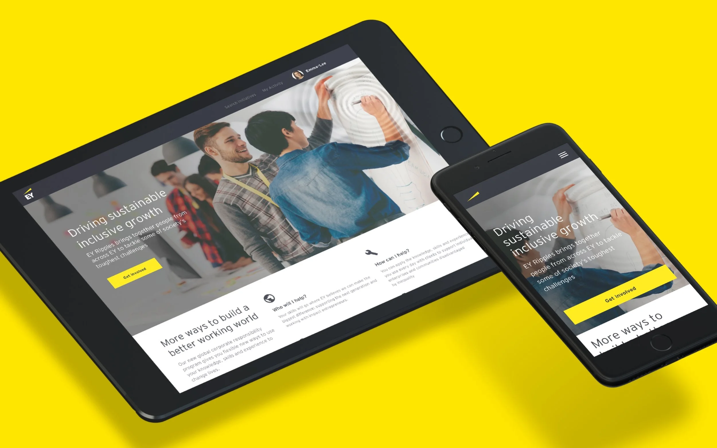
Delivered a fully responsive employee-facing experience, accessible across devices.
Redesigned and streamlined administration portal, improving efficiency and reducing operational friction.