Meet LBX, the first UK based cryptocurrency exchange platform
Length: 6 Months
Role: Senior Product Designer (UX/UI)
Skills: UI design, User flows, Wireframing, Prototyping, User testing, Personas, Mood boarding, Branding and Competitor analysis
The Brief
The London Block Exchange were an early stage startup that had a vision to become the first UK based cryptocurrency exchange platform. With the project taking place whilst the cryptocurrency hype was at its peak, we were well aware that the client needed to strike while the Bitcoin’s were hot. Over a period of 6 months we were tasked with everything from building their brand to planning the app launch strategy, along with further support on any ongoing iterative development post-release.
The Brand
I started by conducting competitor analysis, gathering a range of desk research and inspirational material. Looking at both current competitors as well as other companies that were not directly linked but whose UI and visual language I believed to be appropriate. With the outcome being a set of mood boards with various visual design inspiration, helping us quickly get a better understanding as to what the client was looking for. Allowing us to align and have a clear direction.
Building a close relationship with both the internal marketing team and key stakeholders was vital at this stage. I achieved this by facilitating regular ideation workshops where I was able to really understand the vision and aspiration they had for their company. Together we generated and developed ideas allowing myself to quickly establish key experiences for their user, with a well-defined set of brand principles acting as a checklist to measure all future design decisions against.
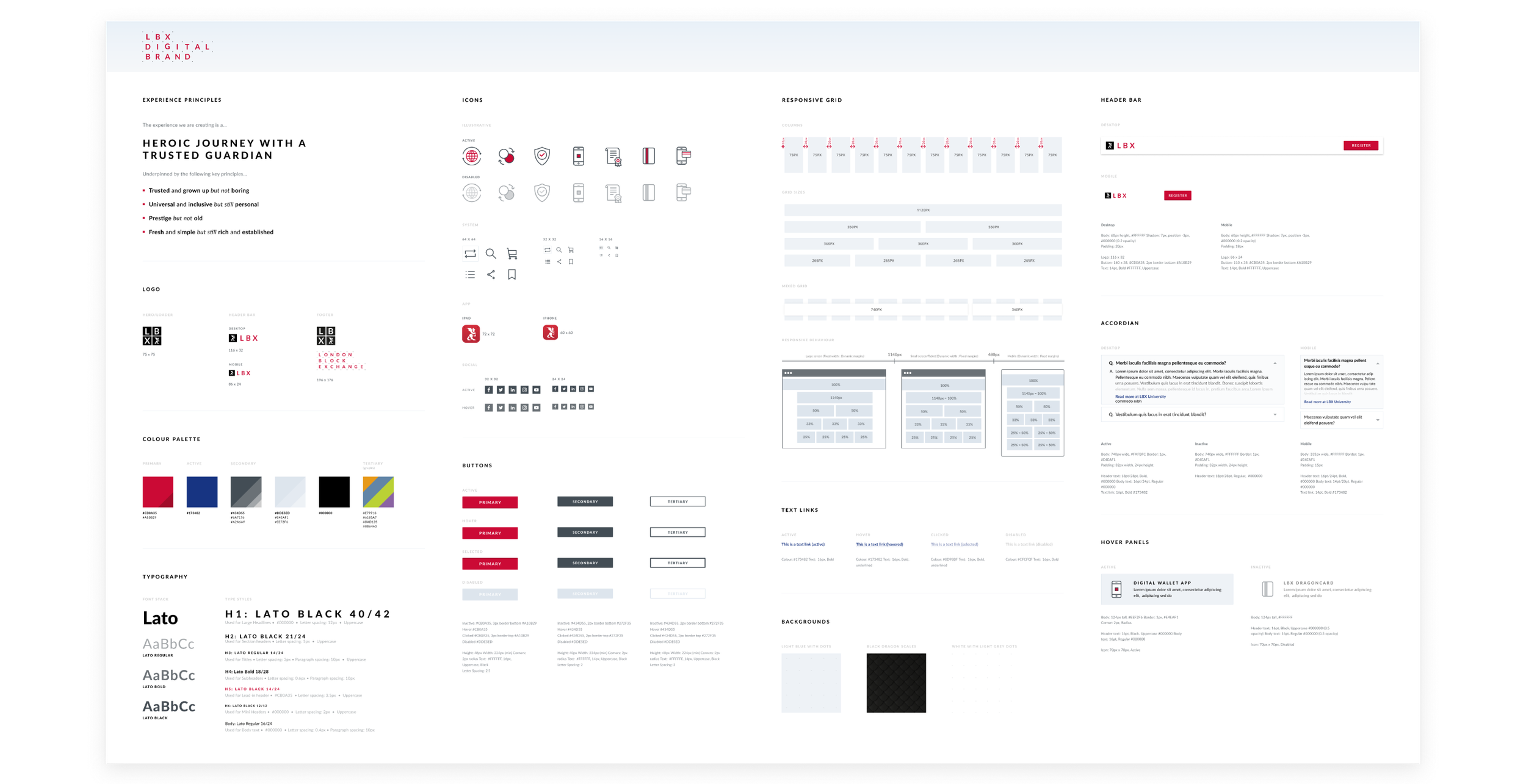
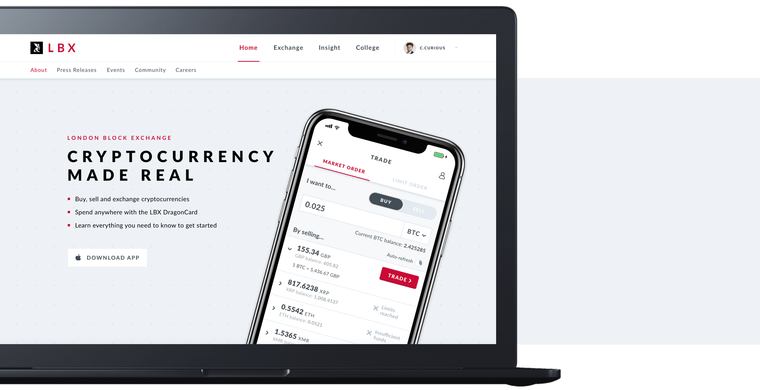
Once we had a clear visual direction established I began working on the landing page design. This page would be used for marketing purposes and would be live up until launch, helping to drive visitors and convert potential users to sign up for regular updates and gain early access to the platform and app. An initial digital brand style sheet was created (see image above) covering all the foundational design elements. Including a colour palette, logos and text styles along with various other UI elements and visual assets. This was then used as the main point of reference and building blocks for all future designs.
The Process
With myself being the lead UI designer I was also working closely with two other UX/UI designers, a project manager and a team of both back-end and mobile developers. Taking the project from concept to build, together we iteratively worked through the development of an MVP iOS app for the beta launch (with android and desktop experiences following shortly after). Conducting 2-week agile sprints that were embedded with user testing and frequently released updates.
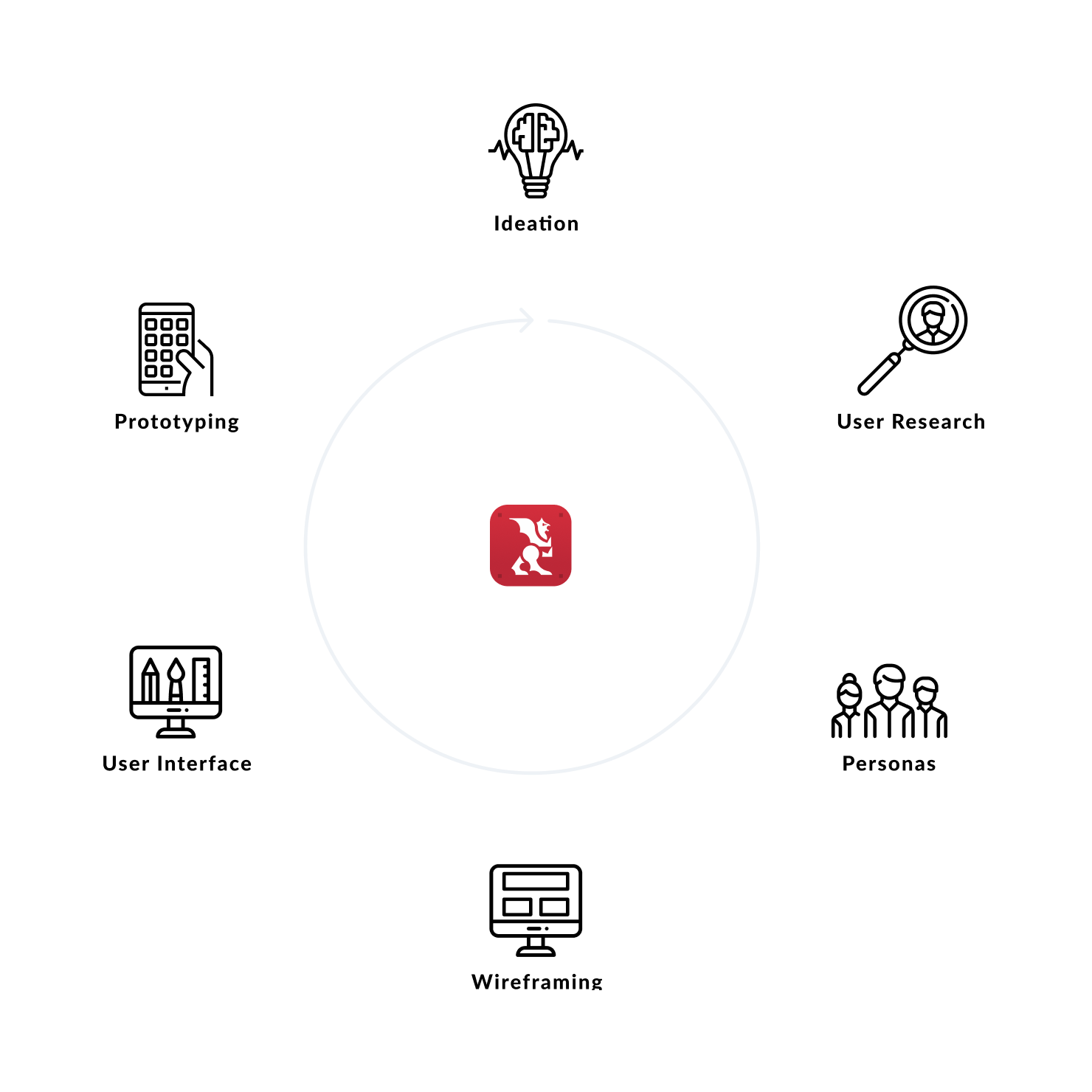
Wireframe Development
Using the competitor analysis and research I gathered in the early brand research phase of the project it gave me a good overview and understanding of the interfaces users were used to by looking at the current landscape. Taking inspiration where needed for journeys and the information displayed allowed me to quickly begin sketching out initial designs for key flows that were ready to start testing with participants.
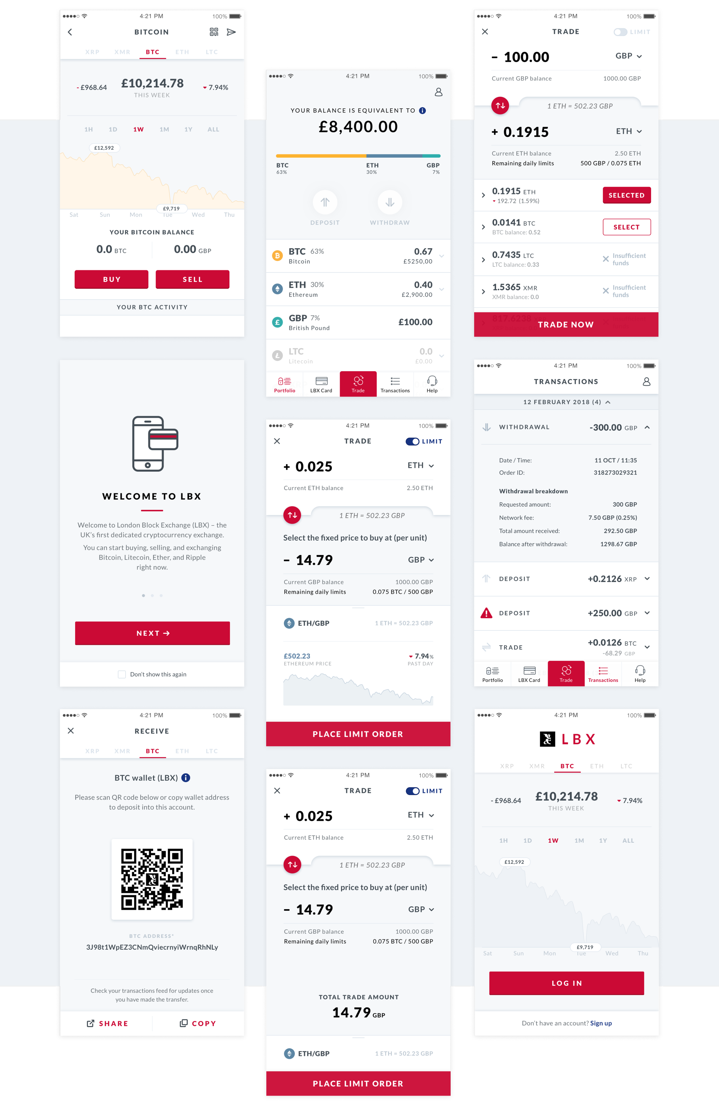
User Feedback
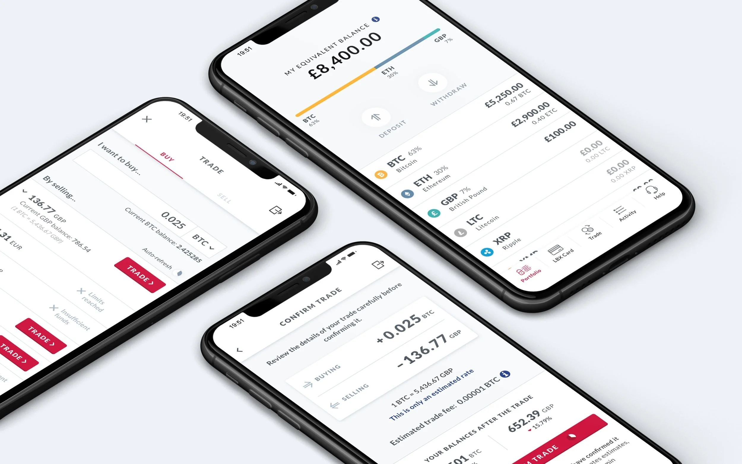
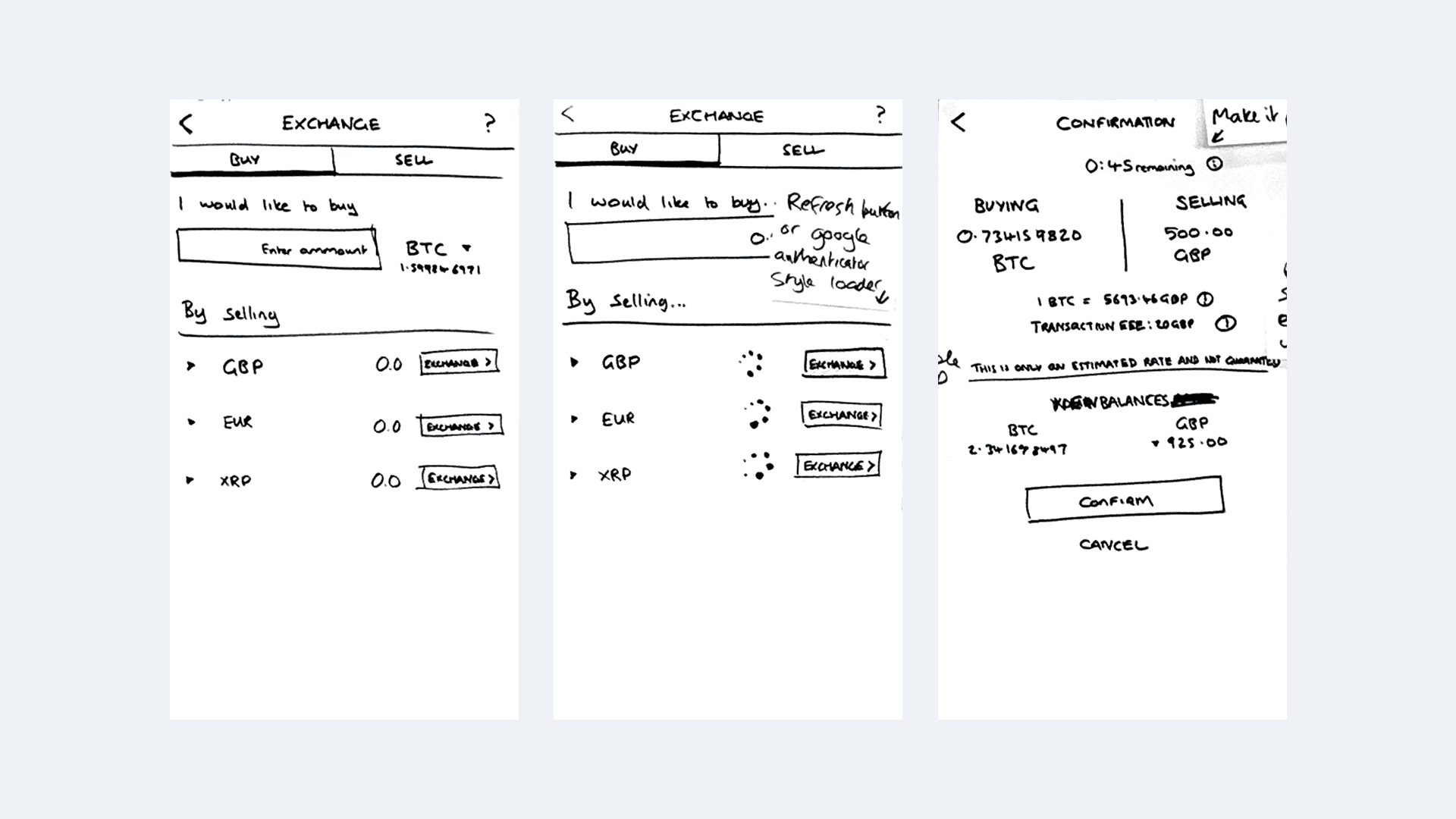
During the initial tests we quickly found the ‘trade’ screen to be the area that users were finding the hardest to navigate and understand. Below are a few of the key iterations I made during this process, each version adding/removing and updating information displayed in response to the users feedback. As you can see from the image below, this particular screen went through quite a few iterations, during the design process we also received several new requests from the client that were outside of the original scope and planned user testing periods. This meant that we had to take quite an agile approach to make sure we were always testing the correct and most useful designs to acquire the feedback we needed to make the right design decisions.
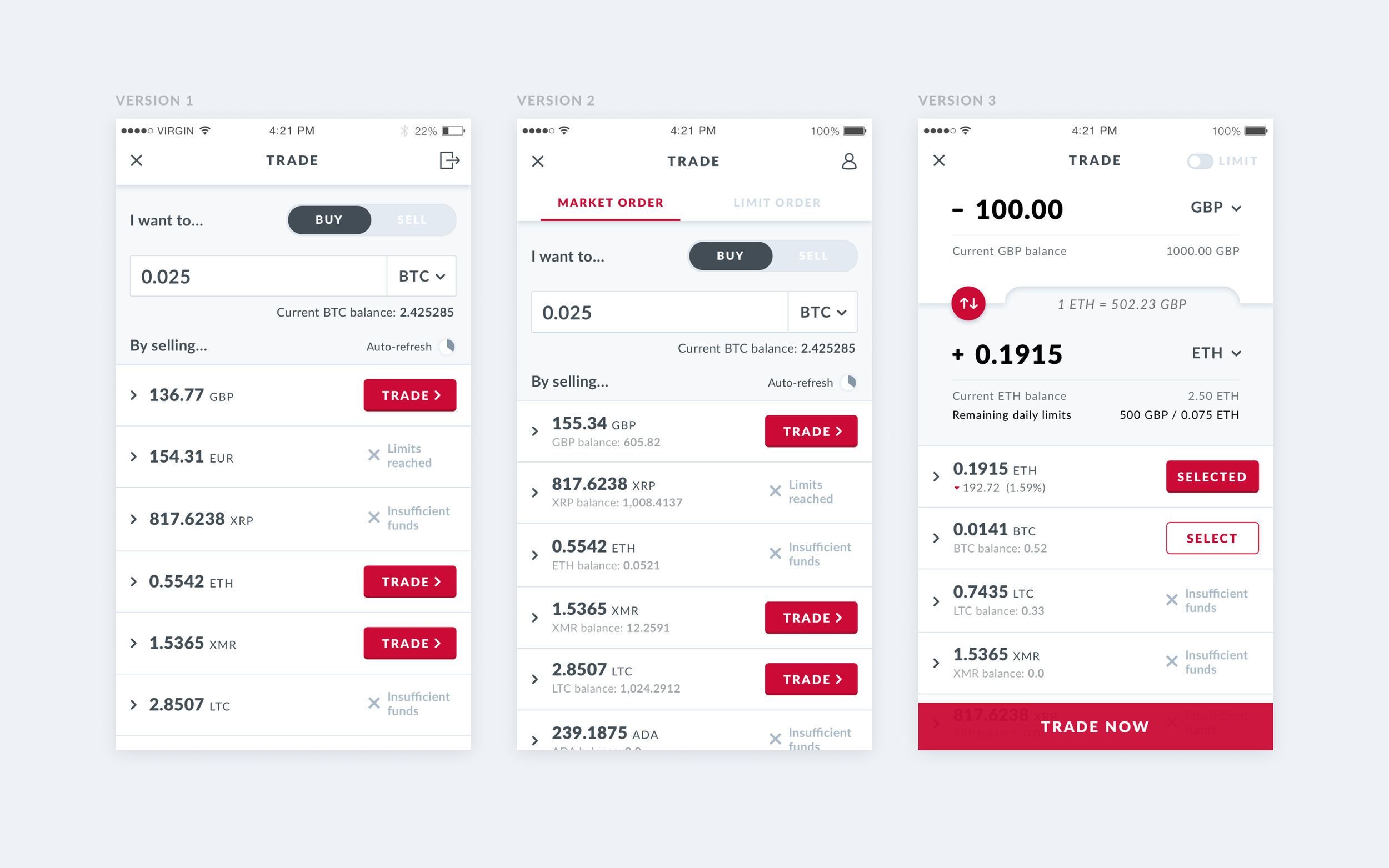
Amongst many other changes and improvements that were made to the ‘trade’ screen, the main addition was the dual input field. It became clear that users wanted to be able to tweak the amounts that they were trading to the very last decimal, giving them the ability to alter the amount they are buying/selling with the opposite field reacting instantly.
The Build
It was incredibly useful working alongside the in-house development team all the way through from the conceptual stages. Having mid-sprint reviews allowed me to present my ideas and designs at an early stage, giving me the opportunity to talk through them with the team to see whether they were achievable or not and what impact they would have on the project.
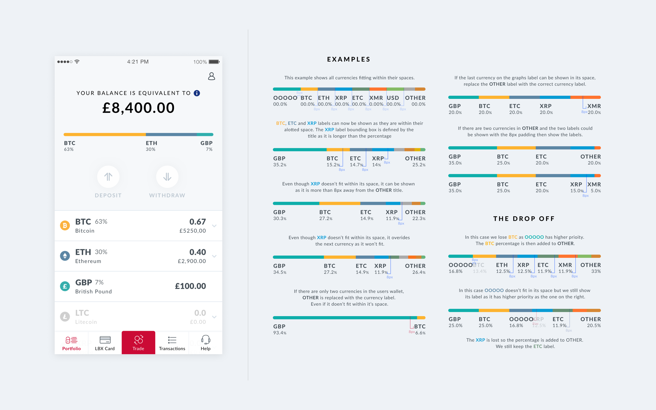
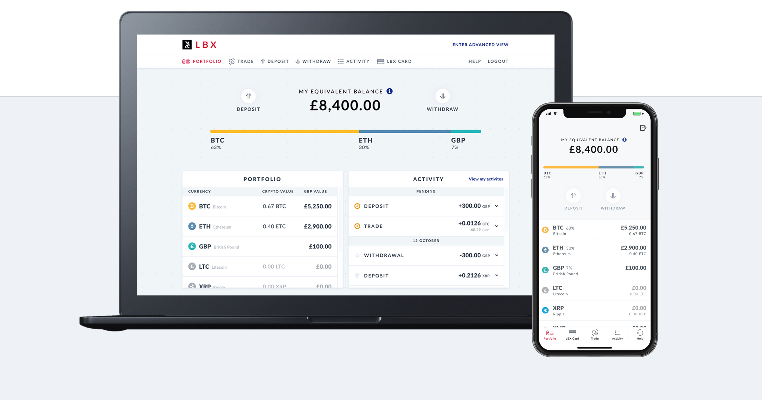
When we started receiving demos from the developers I noticed that we were losing the title tags and information from the portfolio graph. The graph was intended to inform the user what cryptocurrencies made up their overall wallet and their relative percentages, without this information the graph is ineffective. I had to make sure that the thinking behind it was clearly understood by the developers who were building this particular component. It was great being able to sit down and work through this directly with them, creating a series of potential outcomes (see image above) to help visualise how and when the information is presented. This made the logic behind the graph incredibly clear and helped us reduce the amount of data drop-off the user would experience.
Throughout the project right up until release (and beyond) I was testing the build myself, communicating any bugs and UI errors that I found. Creating design alignment documents with annotations giving them all the information needed to fix it.
The Outcome
6,000+ users signed up within days of launching
An iOS app launched to market within 3 months of initial idea
Android app and desktop experience released shortly after